Next.js로 정적 웹사이트 만들기 - 5. Material UI 적용하기
이번에는 프로젝트에 Material UI를 적용하여 레이아웃을 만들어 보고 몇가지 컴포넌트를 사용하여 레이아웃을 만들어보려고 한다.
먼저 Metarial UI를 사용하기 위해 npm package를 받는다.
npm install --save @material-ui/core @material-ui/icons @material-ui/styles
Next.js는 기본적으로 Server Side Rendering 이기 때문에, 단순히 Material UI 컴포넌트를 사용만할 경우 스타일이 정상적으로 먹히지 않는다.
그렇기 때문에 몇가지 작업을 해줘야 하는데, 일반적인 Server Rendering인 경우에는 Material Server Rendering을 참고하면 되고 우리는 Next.js를 사용하기 때문에 Material with Next.js를 참고하면 된다.
기존에 _app.js에 작성된 레이아웃을 바꿔보기 위해 Layout 컴포넌트를 새로 만든다.
components 디렉토리에 Layout.js 파일을 생성하고 다음 코드를 작성한다.
Layout.js
import React, { Component } from 'react';
import Link from 'next/link';
import {
    AppBar,
    IconButton,
    Toolbar,
    Typography,
    Drawer,
    Divider,
    List,
    ListItem,
    ListItemIcon,
    ListItemText,
    Container,
} from '@material-ui/core';
import { Menu, ChevronLeft, Home, Inbox, Mail } from '@material-ui/icons';

const drawerWidth = 240;

class Layout extends Component {
    state = {
        open: false,
    }

    handleDrawerOpen = () => {
        this.setState({
            open: true,
        });
    }

    handleDrawerClose = () => {
        this.setState({
            open: false,
        });
    }

    render() {
        const { children } = this.props;
        const { open } = this.state;
        return (
            <section>
                <AppBar
                    position="static"
                    style={{
                        width: `calc(100% - ${open ? drawerWidth : 0}px)`,
                        marginLeft: open ? drawerWidth : 0,
                        transition: 'all 0.2s',
                    }}
                >
                    <Toolbar>
                        <IconButton edge="start" color="inherit" aria-label="Menu" onClick={this.handleDrawerOpen}>
                            <Menu />
                        </IconButton>
                        <Typography variant="h6" style={{ flex: 1 }}>
                            Static Website
                        </Typography>
                    </Toolbar>
                </AppBar>
                <Drawer variant="persistent" open={open}>
                    <div style={{ width: drawerWidth }}>
                        <div style={{ display: 'flex', justifyContent: 'flex-end' }}>
                            <IconButton onClick={this.handleDrawerClose}>
                                <ChevronLeft />
                            </IconButton>
                        </div>
                        <Divider />
                        <List>
                            <Link href="/">
                                <a>
                                    <ListItem button>
                                        <ListItemIcon><Home /></ListItemIcon>
                                        <ListItemText primary="Home"/>
                                    </ListItem>
                                </a>
                            </Link>
                            <Link href="/post">
                                <a>
                                    <ListItem button>
                                        <ListItemIcon><Inbox /></ListItemIcon>
                                        <ListItemText primary="Post"/>
                                    </ListItem>
                                </a>
                            </Link>
                            <Link href="/about">
                                <a>
                                    <ListItem button>
                                        <ListItemIcon><Mail /></ListItemIcon>
                                        <ListItemText primary="About"/>
                                    </ListItem>
                                </a>
                            </Link>
                        </List>
                    </div>
                </Drawer>
                <Container>
                    <article style={{
                        width: `calc(100% - ${open ? drawerWidth : 0}px)`,
                        marginLeft: open ? drawerWidth : 0,
                        transition: 'all 0.2s',
                        margin: '16px 0',
                    }}>
                        {children}
                    </article>
                </Container>
            </section>
        );
    }
}

export default Layout;
그리고나서 app.js에 작성된 레이아웃 코드를 다음과 같이 변경한다.
app.js
import React from 'react';
import App, { Container } from 'next/app';
import Head from 'next/head';
import Layout from '../components/material/Layout';

export default class RootApp extends App {
    render() {
        const { Component, ...other } = this.props;
        return (
            <Container>
                <Head>
                    <title>Static Website</title>
                </Head>
                <Layout>
                    <Component {...other} />
                </Layout>
            </Container>
        );
    }
}
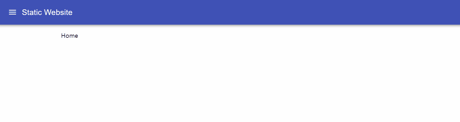
여기까지 작성 후에 화면을 확인해본다.
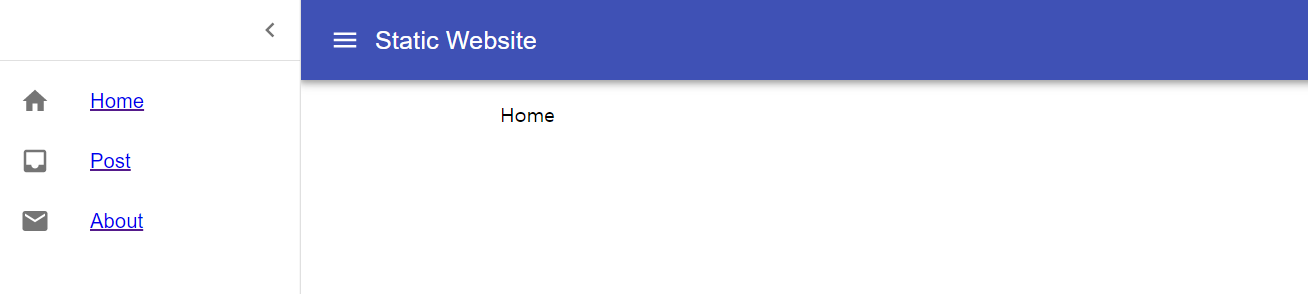
하지만 화면을 새로고침해서 보게되면 처음에 설명했다시피 스타일이 적용되지 않았다가 렌더링이 모두 끝난 후 스타일이 적용되는 것을 볼 수 있다.
이 문제를 해결하기 위해 _document.js와 _app.js를 수정한다.
_document.js
import Document, { Head, Main, NextScript } from 'next/document';
import { ServerStyleSheets } from '@material-ui/styles';
import flush from 'styled-jsx/server';

export default class RootDocument extends Document {
    static async getInitialProps(ctx) {
        // Render app and page and get the context of the page with collected side effects.
        const sheets = new ServerStyleSheets();
        const originalRenderPage = ctx.renderPage;

        ctx.renderPage = () =>
        originalRenderPage({
            enhanceApp: App => props => sheets.collect(<App {...props} />),
        });

        const initialProps = await Document.getInitialProps(ctx);

        return {
            ...initialProps,
            // Styles fragment is rendered after the app and page rendering finish.
            styles: (
                <React.Fragment>
                    {sheets.getStyleElement()}
                    {flush() || null}
                </React.Fragment>
            ),
        };
    }

    render() {
        return (
            <html>
                <Head>
                    <meta charSet="utf-8" />
                    <meta name="viewport" content="width=device-width, initial-scale=1.0, maximum-scale=1, user-scalable=no" />
                    <meta name="description" content="My First Static Website"/>
                    <meta name="keywords" content="nextjs,static,website" />
                </Head>
                <body>
                    <Main />
                    <NextScript />
                </body>
            </html>
        );
    }
}
_app.js
import React from 'react';
import App, { Container } from 'next/app';
import Head from 'next/head';
import CssBaseline from '@material-ui/core/CssBaseline';

import Layout from '../components/material/Layout';

export default class RootApp extends App {
    componentDidMount() {
        // Remove the server-side injected CSS.
        const jssStyles = document.querySelector('#jss-server-side');
        if (jssStyles) {
            jssStyles.parentNode.removeChild(jssStyles);
        }
    }

    render() {
        const { Component, ...other } = this.props;
        return (
            <Container>
                <Head>
                    <title>Static Website</title>
                </Head>
                <CssBaseline />
                <Layout>
                    <Component {...other} />
                </Layout>
            </Container>
        );
    }
}
다시 화면을 확인해본다.
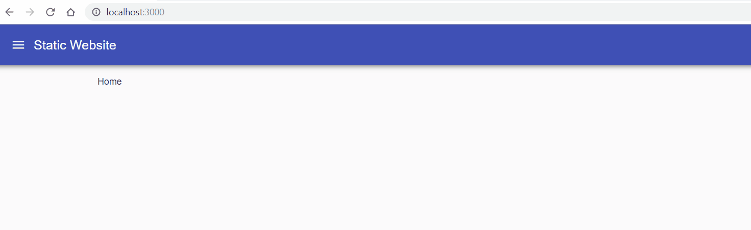
새로고침을 해도 스타일이 정상적으로 적용되는 것을 확인할 수 있다.
이렇게해서 Material UI 컴포넌트를 적용해봤고 컴포넌트들을 사용해서 화면을 구성해 나가면 된다.
다음 글에서는 Ant.Design을 적용하여 Layout을 작성해본다.
Next.js로 정적 웹사이트 만들기 목차